화면을 구성하는 컴포넌트 : 위젯.
https://flutter.dev/docs/development/ui/widgets
Widget catalog
A catalog of some of Flutter's rich set of widgets.
flutter.dev
화면 배치에 쓰이는 기본 위젯들
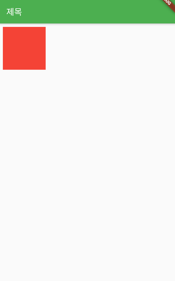
Container
- 다양한 프로퍼티를 갖고 있어서 사용하기에 따라 많은 응용이 가능하다.
- 가로/세로 길이, 색, 패딩, 마진 등의 설정이 가능하고, child 프로퍼티로 또 다른 위젯을 자식으로 가질 수 있다.
body: Container(
          color: Colors.red,
          width: 100,
          height: 100,
          padding: const EdgeInsets.all(8.0),
          margin: const EdgeInsets.all(8.0),
        )
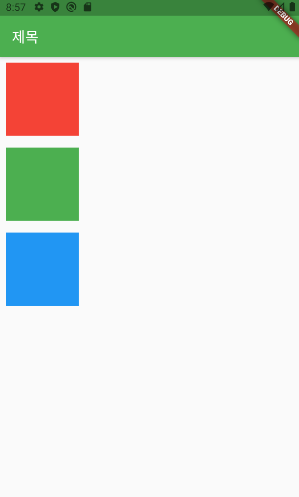
Column
수직 방향으로 위젯들을 나란히 배치하는 위젯.
레이아웃은 대부분 Column과 Row를 조합하여 만들기 때문에 매우 자주 사용된다.
children 프로퍼티에는 여러 위젯의 리스트를 지정할 수 있다.
body: Column(
          children: <Widget>[
            Container(
              color: Colors.red,
              width: 100,
              height: 100,
              padding: const EdgeInsets.all(8.0),
              margin: const EdgeInsets.all(8.0),
            ),
            Container(
              color: Colors.green,
              width: 100,
              height: 100,
              padding: const EdgeInsets.all(8.0),
              margin: const EdgeInsets.all(8.0),
            ),
            Container(
              color: Colors.blue,
              width: 100,
              height: 100,
              padding: const EdgeInsets.all(8.0),
              margin: const EdgeInsets.all(8.0),
            ),
          ],
        )
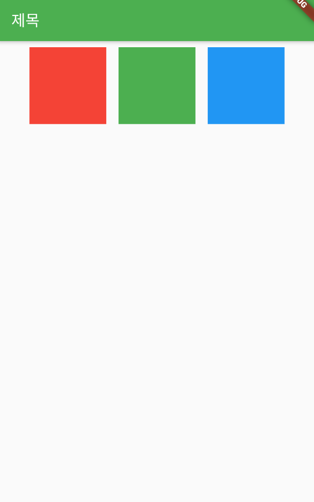
Row
Column과 반대로, 수평 방향으로 위젯들을 나란히 배치.
body: Row(
          mainAxisSize: MainAxisSize.max, // 가로로 꽉 채우기.
          mainAxisAlignment: MainAxisAlignment.center, // 가로 방향으로 가운데 정렬.
          crossAxisAlignment: CrossAxisAlignment.center, // 세로 방향으로 가운데 정렬.
          children: <Widget>[
            Container(
              color: Colors.red,
              width: 100,
              height: 100,
              padding: const EdgeInsets.all(8.0),
              margin: const EdgeInsets.all(8.0),
            ),
            Container(
              color: Colors.green,
              width: 100,
              height: 100,
              padding: const EdgeInsets.all(8.0),
              margin: const EdgeInsets.all(8.0),
            ),
            Container(
              color: Colors.blue,
              width: 100,
              height: 100,
              padding: const EdgeInsets.all(8.0),
              margin: const EdgeInsets.all(8.0),
            ),
          ],
        )
+ Row, Column과 같이 방향성이 있는 위젯은 mainAxis와 crossAxis 관련 프로퍼티가 있다.
mainAxis : 위젯의 기본 방향. Row는 오른쪽, Colum은 아래쪽.
crossAxis : 기본 방향의 반대 방향. Row는 아래쪽, Colum은 오른쪽.
MainAxisSize에 정의된 상수
max : 최대 크기. 남은 공간 모두 차지
min : 최소 크기, 포함된 콘텐츠의 크기만큼만 차지.
MainAxisAlignment & CrossAxisAlignment에 정의된 상수
center : 가운데 정렬
start : 왼쪽 정렬
end : 오른쪽 정렬
이외 spaceEvenly, spaceBetween, spaceAround.
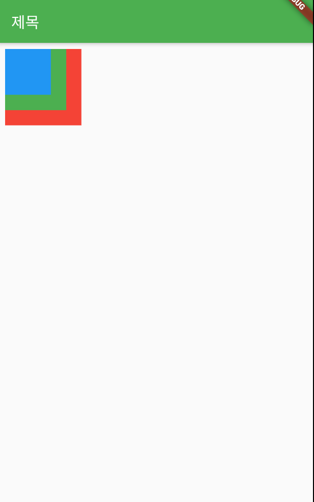
Stack
children 프로퍼티에 나열한 여러 위젯을 순서대로 겹치게 한다.
ex) 사진 위에 글자, 화면 위에 로딩 표시.
body: Stack (
          children: <Widget>[
            Container(
              color: Colors.red,
              width: 100,
              height: 100,
              padding: const EdgeInsets.all(8.0),
              margin: const EdgeInsets.all(8.0),
            ),
            Container(
              color: Colors.green,
              width: 80,
              height: 80,
              padding: const EdgeInsets.all(8.0),
              margin: const EdgeInsets.all(8.0),
            ),
            Container(
              color: Colors.blue,
              width: 60,
              height: 60,
              padding: const EdgeInsets.all(8.0),
              margin: const EdgeInsets.all(8.0),
            ),
          ],
        )
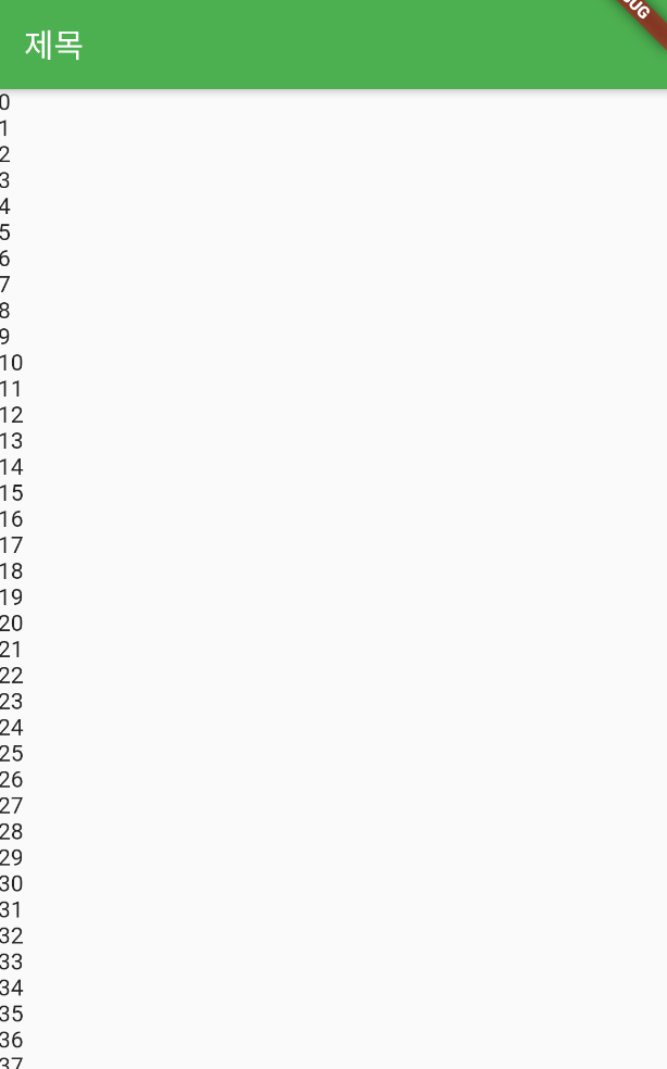
SingleChildScrollView
스크롤 가능한 위젯. 안드의 스크롤뷰 느낌..?
final items = List.generate(100, (i) => i).toList(); // 0부터 99까지 값을 갖는 리스트 생성.


body: SingleChildScrollView(
          child: ListBody(
            children: items.map((i) => Text('$i')).toList(),
          )
        )
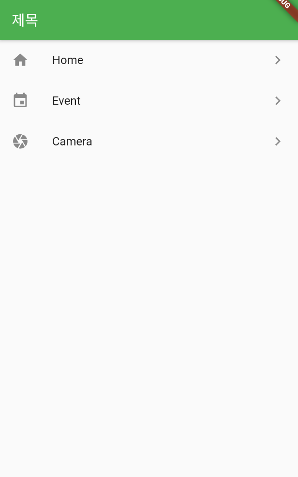
ListView
리스트를 표시하는 위젯. SingleChildScrollView와 ListBody의 조합과 동일한 효과를 내지만 좀 더 리스트 표현에 최적화된 위젯.
ListView에 표시할 각 항목의 레이아웃은 직접 정의해도 되고, 리스트 아이템을 쉽게 작성할 수 있는 ListTile 위젯을 사용해도 된다.
ListView(
          scrollDirection: Axis.vertical,
          children: <Widget>[
            ListTile(
              leading: Icon(Icons.home),
              title: Text('Home'),
              trailing: Icon(Icons.navigate_next),
              onTap: () {},
      ),
            ListTile(
              leading: Icon(Icons.event),
              title: Text('Event'),
              trailing: Icon(Icons.navigate_next),
              onTap: () {},
            ),
            ListTile(
              leading: Icon(Icons.camera),
              title: Text('Camera'),
              trailing: Icon(Icons.navigate_next),
              onTap: () {},
            ),
          ]
        )
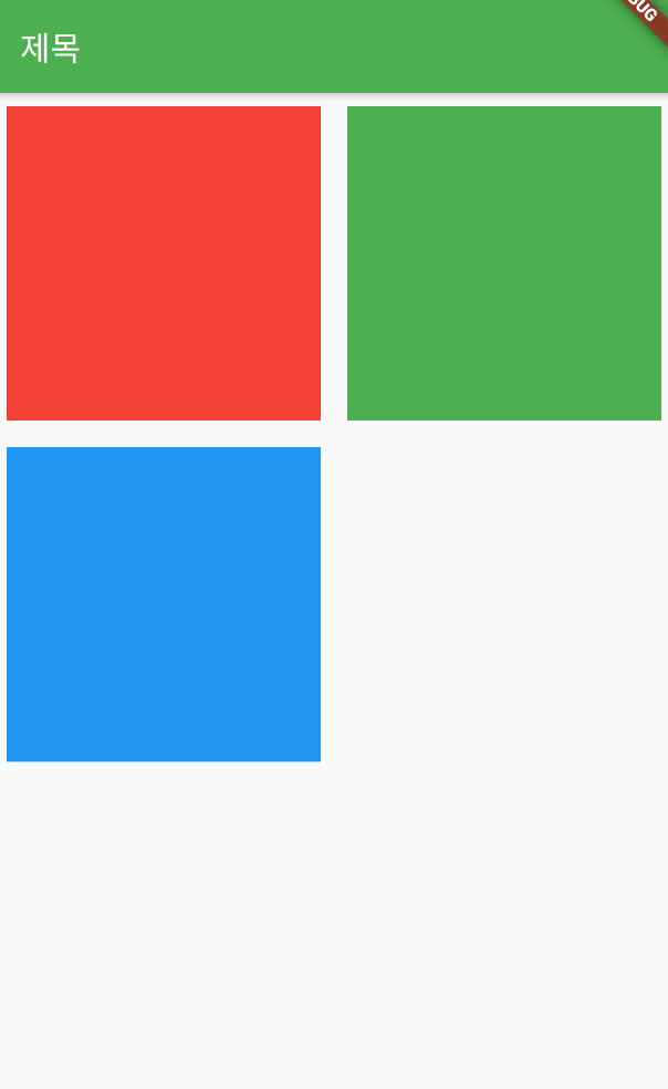
GridView
열 수를 지정하여 그리드 형태로 표시하는 위젯.
GridView.count() 생성자를 통해 간단하게 그리드를 작성해볼 수 있다.
crossAxisCount 프로퍼티에 열 수를 지정할 수 있다.
body: GridView.count(
          crossAxisCount: 2, // 열 수
          children: <Widget>[
            Container(
              color: Colors.red,
              width: 100,
              height: 100,
              padding: const EdgeInsets.all(8.0),
              margin: const EdgeInsets.all(8.0),
            ),
            Container(
              color: Colors.green,
              width: 100,
              height: 100,
              padding: const EdgeInsets.all(8.0),
              margin: const EdgeInsets.all(8.0),
            ),
            Container(
              color: Colors.blue,
              width: 100,
              height: 100,
              padding: const EdgeInsets.all(8.0),
              margin: const EdgeInsets.all(8.0),
            )
          ]
        )
PageVIew
여러 페이지를 좌우로 슬라이드하여 넘길 수 있도록 해주는 위젯.
PageView (
          children: <Widget>[
            Container(
              color: Colors.red,
            ),
            Container(
              color: Colors.green,
            ),
            Container(
              color: Colors.blue,
            )
          ]
        )
탭과 함께 쓰지 않으면 좌우로 슬라이드가 가능한지 사용자가 모를 수 있어서 보통 단독으로 쓰이진 않는다.
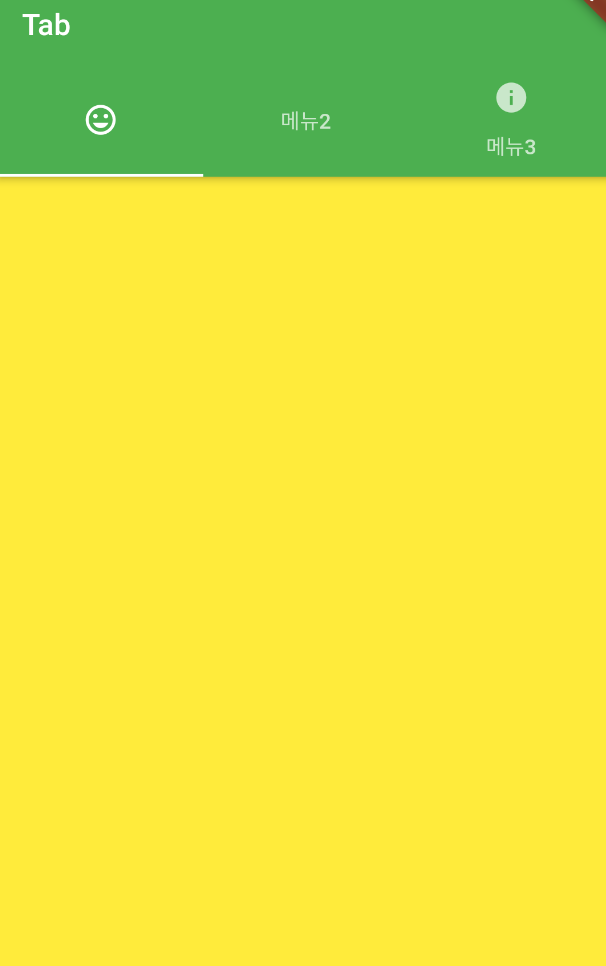
AppBar, TabBar, Tab, TabBarView
이 위젯들을 조합해서, PageView와 유사하지만 페이지와 탭이 연동되는 화면을 구성할 수 있다.
탭이 있기 때문에 PageView만 단독으로 사용하는 것보다 사용성이 높다.
DefaultTabController(
        length: 3, // 탭 수
        child: Scaffold(
          appBar: AppBar(
            title: Text('Tab'),
            bottom: TabBar( // bottom 프로퍼티에 TabBar 지정
              tabs: <Widget>[
                Tab(icon: Icon(Icons.tag_faces)),
                Tab(text: '메뉴2'),
                Tab(icon: Icon(Icons.info), text: '메뉴3'),
              ],
            ),
          ),
          body: TabBarView( // body 프로퍼티에 TabBarView 배치
              children: <Widget>[ // children 프로퍼티에 표시할 화면 배치
                Container(color: Colors.yellow,),
                Container(color: Colors.orange,),
                Container(color: Colors.red,),
              ]
          )
        )
    )
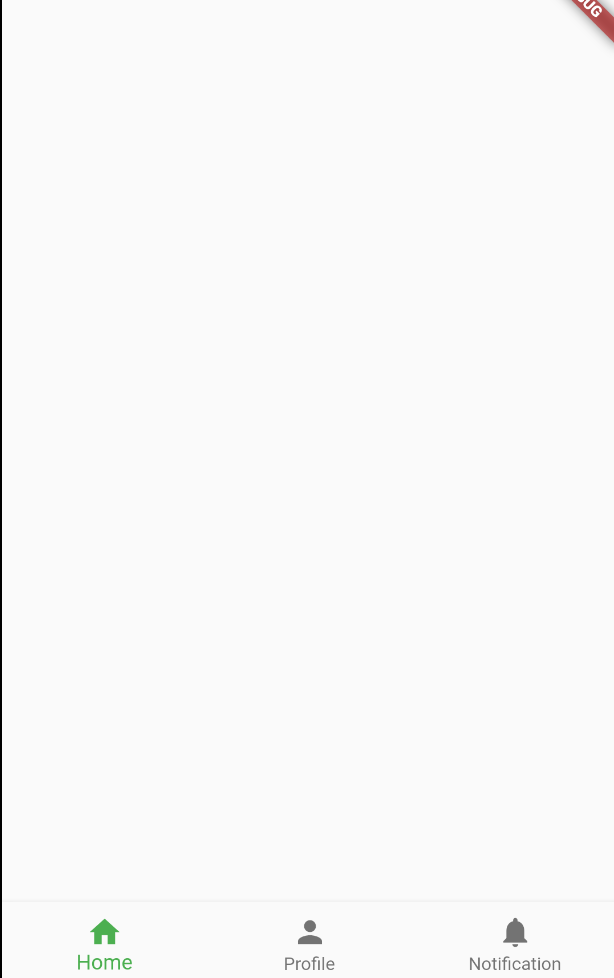
BottomNavigationBar
하단에 2 ~ 5개의 탭 메뉴를 구성할 수 있는 위젯. 최근 Android와 iOS 모두에서 자주 사용하는 UI이다.
Scaffold(
        bottomNavigationBar: BottomNavigationBar(items: [
          BottomNavigationBarItem(
            icon: Icon(Icons.home),
            label: 'Home',
          ),
          BottomNavigationBarItem(
            icon: Icon(Icons.person),
            label: 'Profile',
          ),
          BottomNavigationBarItem(
            icon: Icon(Icons.notifications),
            label: 'Notification',
          ),
        ]),
      )
서적 : 오준석의 플러터 생존코딩
'[Flutter]' 카테고리의 다른 글
| [Flutter] Widget / 위젯 - 위치, 정렬, 크기를 위한 위젯 (0) | 2021.08.15 |
|---|---|
| [Flutter] 다양한 예제 연습 환경들 (0) | 2021.08.14 |
| [Flutter] 코드 자동 완성 팁 (0) | 2021.08.14 |
| [Flutter] 앱 구조 (0) | 2021.08.14 |
| [Flutter] 프로젝트 구조 (0) | 2021.08.13 |


